APPLE
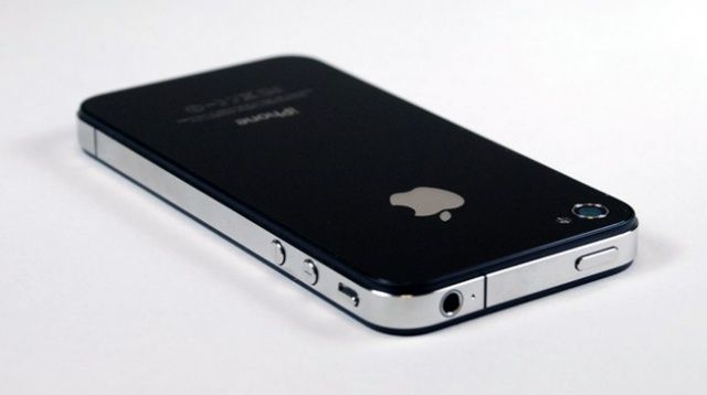
Are you on your Macbook, iPhone, or iPad right now, reading this blog? If not, I’m sure you are still curious to know how the Apple logo came to be. Did you know Steve Jobs had just came back from an apple farm after he had started a fruitarian diet? At first, he made the apple logo rainbow-coloured because he wanted to represent the fact that they could make colour graphics. The apple is bitten simply because without it, Steve Jobs thought that it looked like a cherry to people!
NIKE

Carolyn Davidson was the one who create this logo. In 1971, she was chosen while she was working on a graphic design assignment at her school. She didn’t really like it at first, but she said that she would grow to get used to it. The crazy part is she was only paid $35, which sounds a bit low compared to what it is worth today!
STARBUCKS
If you haven’t seen the old Starbucks logo, you may be in shock because it is a mermaid who is sitting with two tails, not one! In addition, she is shirtless and is surprisingly sexual. The mermaid is thought to actually be from the many other symbols/people from Greek mythology. Due to the fact that it was sexual, it has been adapted to fit into today’s society.